As part of that exercise we had to find a way to visualise the history of the KPI values (timestamp, value pairs) and I started to play around with charting frameworks and figured it makes sense to write up what I have found out. The list of solutions is kind of arbitrary and is by all-means not aiming to be a complete list of available charting frameworks, but gives you a glimpse of what is out there.
The source code is available on my Github account. Feel free to clone the repo and play around with it yourself. There are 4 tagged versions available ...
- v0.1 - Featuring charting based on sfreechart
- v0.2 - Featuring charting based on highchart
- v0.3 - Featuring charting based on D3
- v0.4 - Featuring charting based on chartjs
I started with a very simple server based charting solution called SFreeChart. It is Scala wrapper around JFreeChart. I was able to get that up and running very fast, but realised very quickly that it would not give me what I want, because I do not want to manage the files on the server side and the chart is not interactive.
 |
| KPI charted with SFreeChart |
Note: While I was looking into how to manage the files on the server side I found Scala automatic resource management, which is a very nice way to make sure that you always manage/close your resources (e.g. file descriptors, database connections, ...). Recommended. Take a look at it.
At Gilt we are using Gatling to do our load and performance testing. The Gatling charts are very nice and are based on Highcharts, a charting solution from Highsoft. Highcharts is free for non-commercial use. For commercial use, you have to get a license.
Highcharts is awesome! To get into it you can use the online documentation or you can read the book. The API online documentation is very well done. It has lots of examples and links to jsFiddle and lets you experiment with the framework. The book is very well structured and is a must read, if you want to get serious about Highcharts.
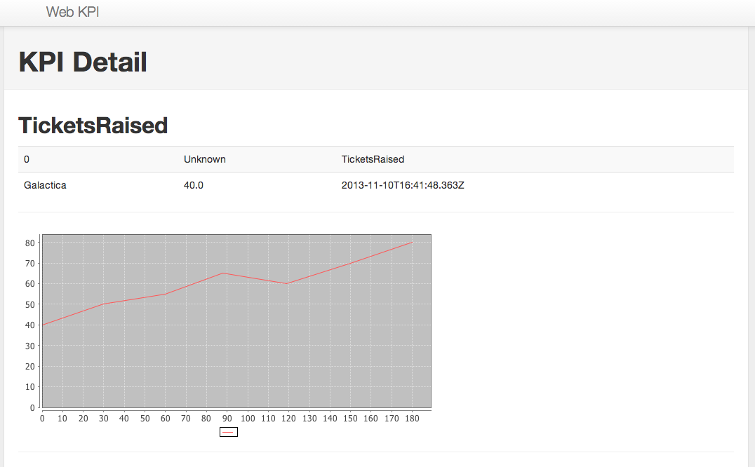
 |
| KPI charted with HighChart |
The one thing that made me keep on looking was the license fee for commercial use.
Next I looked at D3 (Data-Driven Documents). D3 is not really a charting framework. It is much bigger, much more powerful. It allows you to visualise data in any way imaginable. It is unbelievable what you can do with D3!!! But ... the flexibility comes at a price. For me the best way to look at it is the way Git is structured: If Highcharts is the porcelain of charting then D3 is the pluming. D3 is raw. There is nothing you cannot do, but you have to do it (lots of pixel pushing).
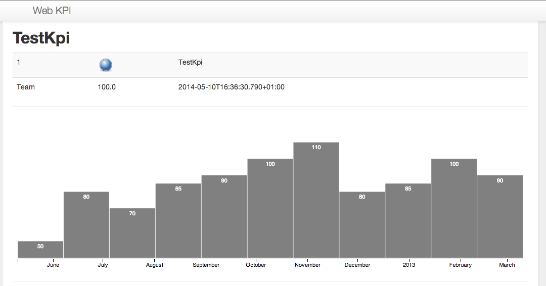 |
| KPI charted with D3 |
At the end I was looking for a client-side, license-free, easy-to-use charting framework and stumbled of the new kid on the blog: Chart.js. Chart.js is new and I was able to make it work in half an hour. For now it seems to fit the bill.
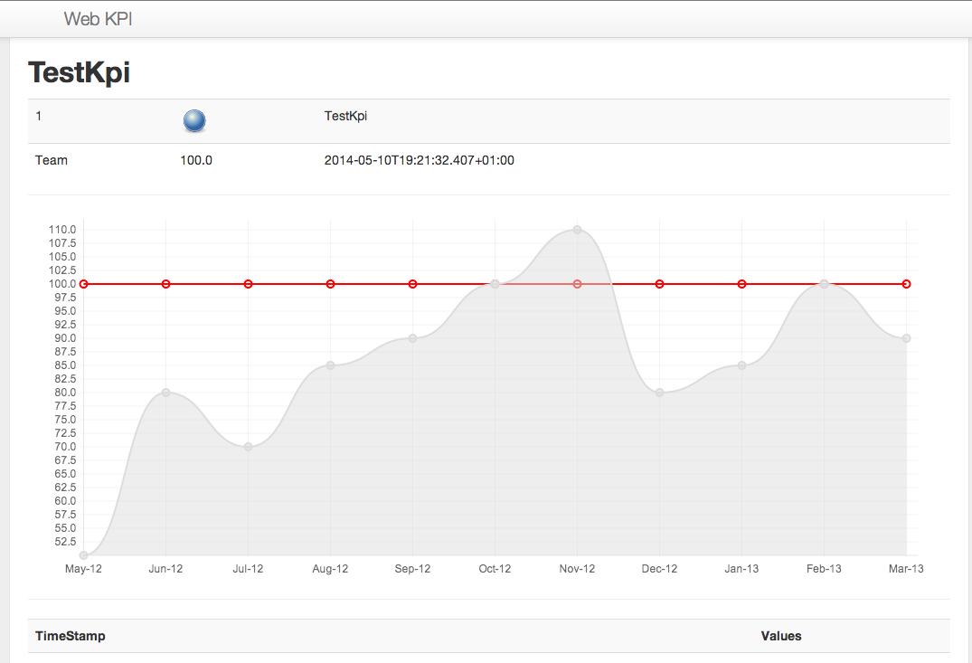 |
| KPI charted with Chart.js |
As I said this is by no means an all-inclusive review of all available charting solutions. All discussed solutions and approaches have their merits. It comes down to your requirements to decide what is the right one for you.